A new look for Radeberger Pilsner
Radeberger Pilsner introduces a refreshed global packaging design.
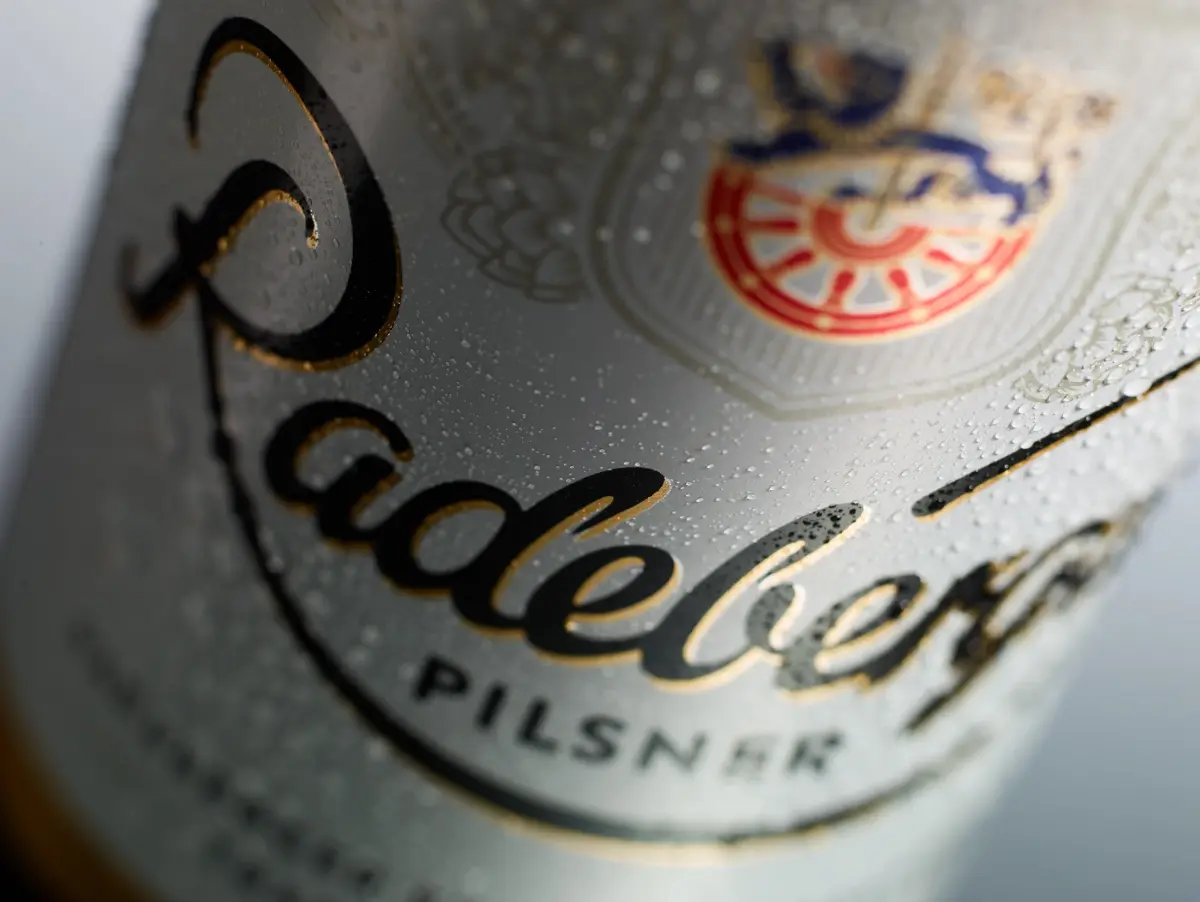
White and gold remain the core brand colors, emphasizing the elegant, and stylish character of Radeberger Pilsner and conveying a positive and fresh impression.The wordmark has been modernized and now appears in black with a subtle gold outline. Greater emphasis is placed on the city crest, featuring the Saxon lion and the rotating wheel – symbols of heritage, pride and progress. The statement “Pilsner Perfection since 1872” now takes a more prominent position, clearly expressing the brand’s standard.Ingredients and origin remain visible, reinforcing transparency, quality and the commitment to brewing in Germany.The result is a modernized look that remains unmistakably Radeberger Pilsner – clear, confident and rooted in tradition, while ready for the future.So, watch out for the new look on shelf!